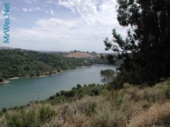
Making the background image was easy
It wasn’t too hard to create my Twitter background. I used Paint.Net with layers to create this one. I loaded the main picture to the bottom layer. In case you didn’t notice, this was an image from my recent hiking trip to Lake Chabot in Castro Valley. I created a second layer for the text. It took a little while to get the text to look the way I wanted it. Then I saved it. It took a few tries, because the first time, the picture wasn’t scaled properly. I ended up with the focus being zoomed into the upper left part of the picture. I went back and changed the dimensions of the picture to about 20″ wide, then resaved it. This brought most of the picture into focus. For wider screens I’m sure it will look normal. I’ll probably do 17″ next time. I’ll probably do a little more experimentation with the image size and the background color.
Font selection was the hardest part of the image
It took me longer to figure out which font I would use than it did to generate the image file. For the font choice I was going for a specific look that says,”This is Wes Johnson” I initially created 117 various combinations of Font families, boldness, and capitalization. I picked my 3 favorites from the list, then I had some others pick our their 5 choices out of the 117. I am still amazed that there was unanymous agreement on the Font family and capitalization to use. I chose the font that is on the picture above. I’m sure I’ll update the image in the future or at least add more personal marketing info. In the meantime, I think this image will work fine.
Till next time, visit my Twitter profile and follow me @mrwes